Essential Photo Optimization Guide to Speed up Your Website

Pavla Bartonova
Founder
As a website owner, one of the most important tasks you will need to do will be to make sure your photos are well optimized and look great on all devices so your website loads FAST.
And YES, with all devices, we mean also high resolution screens (high pixel density /high DPI/ displays, trademarked as Retina displays on Apple’s devices).
Especially for our clients, hotels, and other businesses seeking to engage its customers through visually rich experiences, it is of an utmost importance to optimize websites’ photographs.
(Note: this article is only about optimization of photographs, not other website graphics, such as logos, icons etc.)
Image optimization is a process of delivering your high quality images in the right format, dimensions & resolution while keeping the smallest possible file size.
As photos are big in file size, dimensions and resolution, the goal of image optimization is to turn ‘heavy’ large images into compressed light smaller files – and ideally, create several image size variations for display on different devices’ screens (large desktops, tablets, small phones).
But there is a challenge.
As you compress photographs, their quality drops.
Because you want your photos looking great on your website, when saving photos for the web you must compromise between the image quality and the image file size.
In other words, you must make the image file size as small as possible while still retain a good or acceptable quality.
For the web, you must make the image file size as small as possible while still retain a good or acceptable image quality.
IDEALLY, image optimization should be automated.
Especially if you have many photos on your website, image optimization would be a headache without automation process.
You can, of course, still opt to optimize your photos manually, it is fine if your website doesn’t have many photos, or you do not want to use just another plugin, extension or paid online image optimization service.
In that case, we put together this guide to optimize your photos for the web in as few steps as possible with 1 useful (and free) tool (obviously, not Photoshop).
But before we see the steps of this guide, let’s discuss why we need image optimization and a bit about optimization for high DPI screens.
Why to optimize your images?
Image optimization makes your website faster.
Unfortunately, visitors to your website do not want to wait to see your website’s content.
Best loading time for your website is under 2 – 3 seconds ONLY!
You see, that’s really not much time!
If a website is too slow, Google might limit the number of URLs it will crawl from your website.
In July 2018, Google announced that page speed is a ranking factor for mobile searches.
2 seconds is the threshold for e‑commerce website acceptability. At Google, we aim for under a half second. – Maile Ohye, Google
Speeding your website’s load time will have the following positive consequences:
- Higher Google ranking
- Better user experience (UX) for your visitors, which leads to decreased page abandonment and higher conversions (there is a bigger probability that your website’s visitors will become your customers – which is the primary goal of having a website).
Optimizing images for high pixel density screens
Images for high DPI screens are optimized in the same way as other photos, however they shall have bigger dimensions (double dimensions or more).
Optimizing images for high DPI displays is an important step in image optimization as the resolution of displays grows increasingly higher.
To have your photos look great on high DPI displays it is helpful to know how your web CMS, theme or custom CMS serves images to those screens.
There are 2 main approaches to serving images to high pixel density screens:
- a multiple image approach (adaptive images)
- a single image approach (compressive image technique).
These 2 approaches need to be taken into consideration when saving photos in JPEG format and choosing the right amount of image compression level.
In the multiple image approach, 1 image is saved into multiple derivative image assets of different dimensions that are made to load on different devices (desktops, tablets, phones).
This is becoming the best practice for serving images to high DPI screens.
(For example, upon uploading your image to WordPress, the CMS automatically creates 3 size versions of that image. Your WordPress theme may be customized to create even more image size versions.)
The single image approach (compressive image technique) uses 1 large single image that is saved (as the word ‘compressive’ implies) as a very low quality JPEG file and this image is used for all device screens, large and small.
If you use this approach, you want to apply a higher JPEG compression to your photos to make your images as small as possible.
See how low you can go with your compression level in this article, Retina revolution.
The compressive image technique serves a highly compressed 2x (double dimensions) image to all devices.. – Google Developers website
Automated image optimization
Automated image optimization can be achieved through:
- ready-made plugins/extensions integrated within your website,
- custom made solutions implemented by your web developer
- with the help of online image manipulation services which deliver your photos to computers all around the world through their global content delivery network (CDN).
Image optimization plugins and extensions
Some plugins or extensions only compress your photos, others offer also cropping and resizing.
This means, you need to decide whether you choose fully automated process or semi-automated process.
To name a few:
- Imagify (WordPress plugin and online tool)
- ShortPixel (plugin & online tool)
- Ewww Image Optimizer
- reSmush.it
- Kraken
Online image manipulation services (image CDNs)
How to manually optimize your photos
If you want to optimize photos for your website yourself, you do not need to pay for a professional software to prepare your photos for the web (such as Adobe Photoshop).
It can be easily done using an online tool that can crop, resize dimensions, downsample and compress your photos.
Here are 2 tools which can help you optimize your photos as easily as possible:
- Image Resize (free, simple & elegant)
- ILoveIMG (free & paid /very cheap plan/, nicely designed website)
Just so you understand, to find the ideal & really simple tool that could crop to ratio, resize, downsample to 72 dpi and compress images well enough and save JPEG wasn’t that easy.
Desktop apps on PC/Mac could do some of the above, but couldn’t compress well and they can not save photos as a progressive JPEG (only baseline, more on that later).
On the other hand, online tools could compress images (some better, some worse), but they couldn’t crop to ratio or were not user friendly.
(If you come across another useful tool that can do all the above, please share with us in the comment section.)
6 steps to easily optimize your photos for the web
- Decide on your image aspect ratio.
- Find out how much space (dimensions) will your images occupy on your website.
- Multiply your dimensions by 2 for high pixel density screens.
- Use Image Resize or ILoveIMG to crop, set dimensions, downsample resolution & compress your photos.
- Check that your images have the right names.
- Upload to your website & assign ALT (alternative text) & TITLE to your images.
1. Decide on your photos’ image aspect ratio
Image aspect ratio is the proportional relationship between the width and height of an image (width:height) expressed as a number, like 16:9 (a square image has an aspect ratio of 1:1, since the height and width are the same).
The most common image aspect ratios in web design are 16:9 (known as widescreen) and 4:3 (known as fullscreen).
In still photography, the most common aspect ratios are 4:3, 3:2, and recently 16:9.
Your website’s images do not all need to have the same aspect ratio, you can mix several aspect ratios in your layout.
The image aspect ratio of your photos might be also changing depending on which device your website is viewed on as images adapt to the layout.
But it is a good idea to maintain a consistent aspect ratio throughout a website design to ensure websites render well on a range of window sizes.
At least make sure that images that will be placed in the same photo gallery or next to each other on a page have the same aspect ratio.
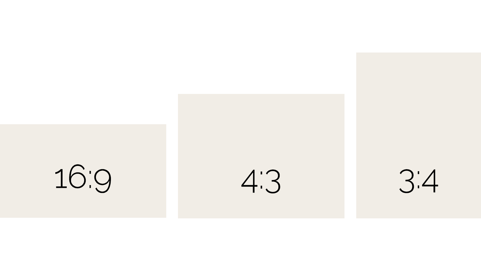
16:9 and 4:3 are aspect ratios for horizontal (landscape) photographs, 3:4 ratio is for vertical photos (portrait).
2. Find out how much space (dimensions) will your images occupy on your website
Some photos need to be used as large headers, other photos will occupy a much smaller space.
You will be able to reduce your files’ sizes and save your server storage if you know the (at least approximate) space (width & height) each image occupies on your web page and you resize your images to that size, instead of uploading a full size photo straight from your camera.
Finding out what dimensions you need depends on your theme column layout changes as your layout is being resized on screens of various sizes.
For example, your desktop gallery might be designed as a 4 column layout, but on a tablet, the gallery will be only 1 column layout.
As you can imagine, in that case, your image will have smaller dimensions on a desktop but will be larger on tablets.
You will need to see your web page layout on a desktop computer as well as resized on a tablet and figure out the bigger image size.
Use the ‘Inspect Element’ of your browser (mouse right-click in your browser window).
There are also browser add-ons that will help you measure your image dimensions, i.e. Measure-it for Firefox, Ruler Measurement for Chrome etc.
Check what tools are available for your browser and install one.
3. Multiply your dimensions by 2 for high pixel density screens
You figured out your image dimensions, and now, as you want your images to look great also on high pixel density screens, double the dimensions (width & height).
This means, if you need an image of 800×450 px (pixels), your final image will be 1600×900 px.
4. Use Image Resize or ILoveIMG to crop, set dimensions, downsample resolution & compress your photos
So now, when you know your final dimensions, open Image Resize or ILoveIMG in your browser and upload your high resolution photo.
For best results, when compressing files, use your original, high quality photo, do not use images that were already compressed (saved as JPEG lower quality).
Your high resolution photos should be in lossless formats, such as TIFF, or the highest quality JPEG (JPEG is a lossless format, each re-saving degrades your image quality).
Also beware – never increase the dimensions or resolution of a photo, you can only decrease these values, otherwise you will get blurry, low quality photos!
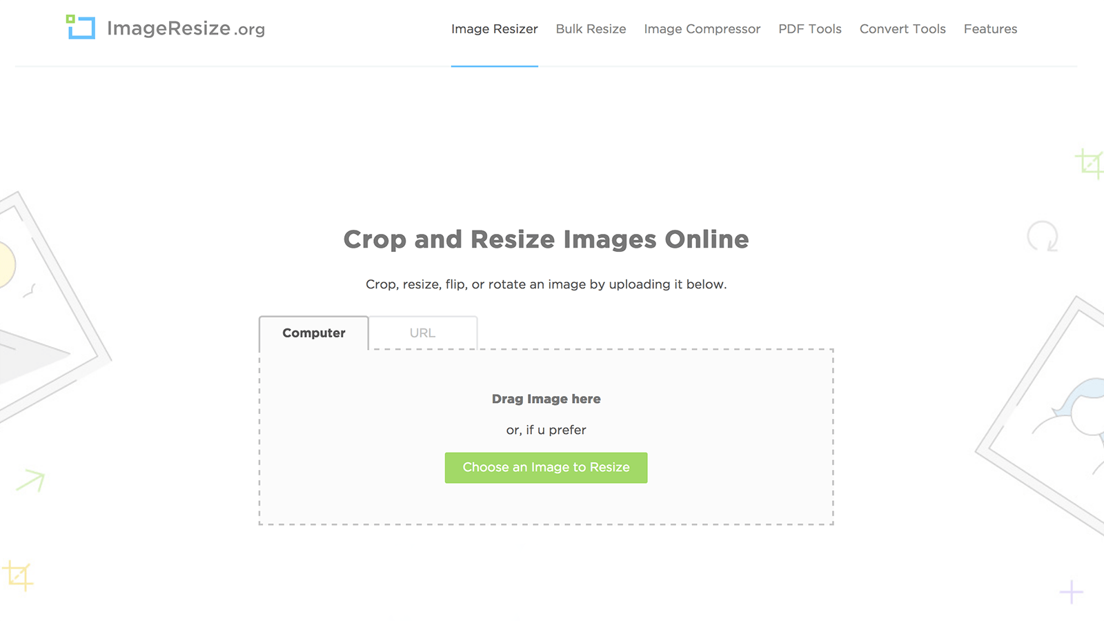
Image Resize is an all-in-one solution to crop, resize, downsample and compress photos. Drag your photo into the upload area or click the green button “Choose an image to Resize”.
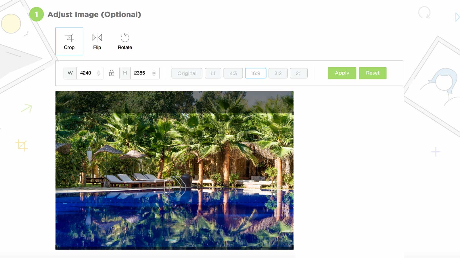
To crop to image ratio in Image Resize, you can choose from 5 ratios (or keep the original). Select your ratio, Select your area by dragging a rectangle/square within your image preview. Click Apply.
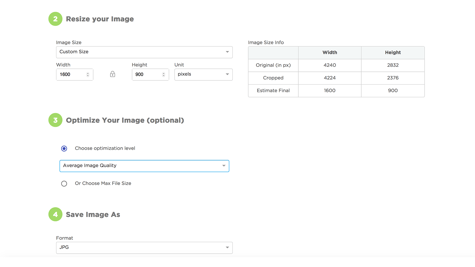
Next, we have the option to resize images (make smaller dimensions) – this is where you will put your desired image width and height. The ‘lock’ icon restrains the image aspect ratio (in our example, it is 16:9). You have 4 JPEG quality options (optimization levels): No change, Best quality, Good image quality and Average image quality (smallest). We chose Average image quality and got a final file size of 255 KB (screenshot below). If we wanted our image to be of even smaller file size, we would select ‘Choose max file size’ and set our value, i.e. 150 KB. Very handy.
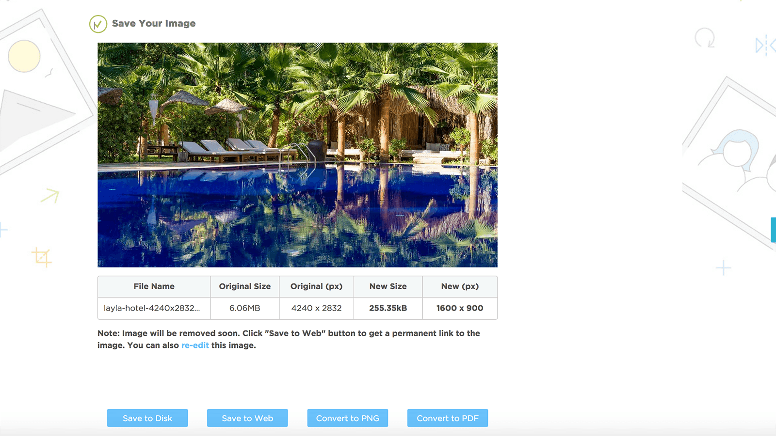
We optimized our image with 1 single tool in 1 single page. Original image file size was 6 MB, dimensions 4240×2832 px, resolution 350 ppi. Optimized image file size is 255 KB, dimensions 1600×900 px, resolution 72 ppi, and our JPEG is progressive. You can also bulk edit up to 20 images at once in Image Resize.
Image Resize tool saved your photos as a progressive JPEG.
Progressive JPEG improves user experience because it loads images on a website in successive (progressive) waves (first as a low quality blurry image until the fully crisp image appears, as opposed to normal/baseline JPEG which reveals an image from top to bottom, line by line, till the whole image shows).
Using progressive JPEG will further speed up your loading time, too, as they are a bit smaller in file size.
The ability for progressive JPEGs to offer low-resolution ‘previews’ of an image as it loads improves perceived performance – users can feel like the image is loading faster.. – Essential Image Optimization Guide by Addy Osmani
If you ever needed to check whether some of your images are progressive or not, use IMGonline.
5. Check that your images have the right names
Before uploading your optimized images to your website, make sure they have the right names.
Image names are an important part of a website’s onsite search engine optimization (SEO) so your property can be easily found in search engines.
Describe well the contents of your image in several words.
Remember to separate the words with a dash (hyphen), not an underscore.
Leave out unimportant words such as prepositions etc. (at, in, for, a, an, the, it, to – so called stop words).
Use all-lowercase, and separate words with hyphens. – Google Developers website
DO: radisson-hotel-superior-room.jpg
DON’Ts:
- radisson_hotel_superior_room.jpg (underscore is not a recognized word separator),
- DSC00677.jpg (search engines do not understand what is in the photo),
- radisson-hotel-DSC00677.jpg (not descriptive enough),
- RADISSON-HOTEL-SUPERIOR-ROOM.JPG,
- radissonhotelsuperiorroom.jpg (this is not a word),
- hotel-bathroom.jpg (too generic, let Google know it is the Radisson hotel),
- RadissonHotelSuperiorRoom.jpg (this is not a word).
6. Upload images & assign ALT (alternative text) & TITLE to your images
ALT (alternative text) is an HTML attribute and it is required for your images.
It is an alternate text for an image if the image for some reason cannot be displayed on your page.
It is an important part of accessibility optimization of a website (so that visually impaired people can understand your website when using screen readers).
It plays a role in your SEO as search engines look for keywords within your image file names.
Therefore create great descriptive alt text for your images.
On the other hand, the title attribute is shown as a tooltip when you hover over the image and it is not required.
Alt text (text that describes an image) improves accessibility for people who can’t see images on web pages, including users who use screen readers or have low-bandwidth connections. – Google
Conclusion
Optimization of your hotel photos is very important both for good Google ranking and your website visitor retention – your visitors do not like to wait while your website slowly loads.
Photos should be optimized for high pixel density screens and compressed as much as possible while still looking good.
Unless you use a fully automated process for cropping, resizing and optimizing your images, you should NEVER upload photos that are not well optimized to your website.
To check how your website’s images perform, use Google’s PageSpeed Insights. This tool analyzes your website’s speed.
We hope this photo optimization guide will help keep your website fast and remain an enjoyable experience for your website visitors.
0 Comments